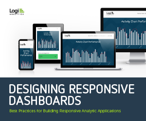
Best practices for Building Responsive Analytic Applications
Perhaps no single trend in recent years has impacted the way people conduct their lives more than the rise of mobile devices and multi-device usage. According to a recent study by Google, 57% of all users now leverage more than one type of device on an average day. This is only expected to grow in the years to come.
The trend towards multiple devices and mobile screens affects every software company and application team. For the developers and product managers who are creating embedded dashboards and reports in their applications, it’s introduced a whole new set of challenges — both in terms of dashboard design and in developing scalable dashboards for a variety of screen sizes.
Many developers have turned to responsive design as a relatively easy, scalable way to tailor analytics experiences to device types. By building embedded analytics on a platform that supports responsive design, for instance, developers can ensure their applications will automatically modify content in response to the user’s screen size.
But being responsive means more than making sure your dashboards look good. It means designing dashboards from the ground up with responsive in mind — making sure they deliver information in easy-to-consume ways across every device.
Key Takeaways from this E-Book:
Logi Analytics, Inc. is a computer software company headquartered in McLean, Virginia, United States with offices in the UK and Sweden. It offers interactive data visualization products for business intelligence and business analytics.